Tuesday Tooling: Visualise Data in the Terminal
It has been a while, so lets just get started with a new blog post.
So Les, what we got this time?
I stumbled upon this by pure chance, but I am really glad that I did.
Plotext, by Piccolomo is a simple library that provides a means to visualise data in the terminal with a syntax that is similar to matplotlib. For example we can create bar charts, histograms, line graphs etc all in the terminal with just a little Python.
Plotext is completely based in the terminal, we do not need a desktop or GUI to visualise the data. This makes Plotext ideal for SSH sessions, where you need to see data. A sysadmin could use this with the psutil Python library to get the current system stats and show them as a graph. You could even add the script to your .bashrc file to run when you connect / create a new terminal. Plotext looks to be a great little library for quick data tasks and it would be ideal in a Raspberry Pi data collection project. So lets install it and have a play.

Hi reader!
Installation
I created a virtual environment and installed plotext using pip3.
pip3 install plotext
Usage
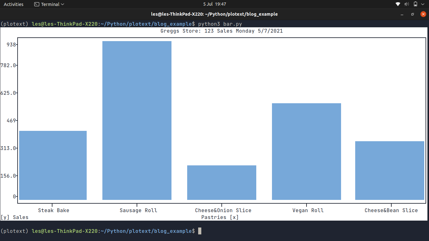
Lets get to grips with this library by creating a simple bar plot which will show the sales for a fictitious bakery. On the horizontal (x) axis we have the items purchased, on the vertical (y) axis are the sales figures.
First we import the plotext library, renaming it to plt.
import plotext as plt
The purchased items are "pastries" and we store the names of the pastries in a list, called pastries. Each item in this list is a string.
pastries = ["Steak Bake","Sausage Roll","Cheese&Onion Slice","Vegan Roll","Cheese&Bean Slice"]
Next we create another list called sales which contains the sales figures for each pastry. Note that the data in both lists should be in the corresponding position. In the example "Steak Bake" sold 400 units, and "Vegan Roll" sold 555 units.
sales = [400, 938, 201, 555, 341]
The next two lines tell the library that we wish to draw a bar plot, using the data stored in pastries and sales and that the plot should be 300 x 30 in size.
plt.bar(pastries, sales)
plt.plotsize(300, 30)
We then set the title of the graph, the headings for the x and y axis and then tell plotext to draw the plot.
plt.title("Greggs Store: 123 Sales Monday 5/7/2021")
plt.xlabel("Pastries")
plt.ylabel("Sales")
plt.show()
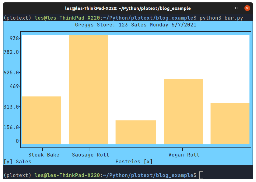
I also learned that we can change the colour of the graphs. So I had some fun and themed my chart to match Greggs branding.
plt.bar(pastries, sales, color = 'gold')
Then I changed the background (canvas) colour of the chart to white.
plt.canvas_color('white')
Lastly I changed the axes colour to the blue / indigo used in Greggs branding.
plt.axes_color('indigo')
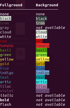
Image Credit: Picolomo
There are lots of colours on offer and we can mix them up to make cool looking charts.
What else can we do?
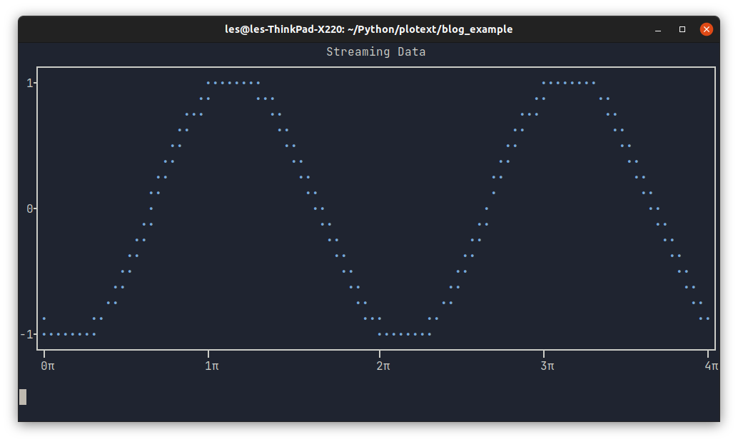
We can stream data into the plot, here is the example sine wave.
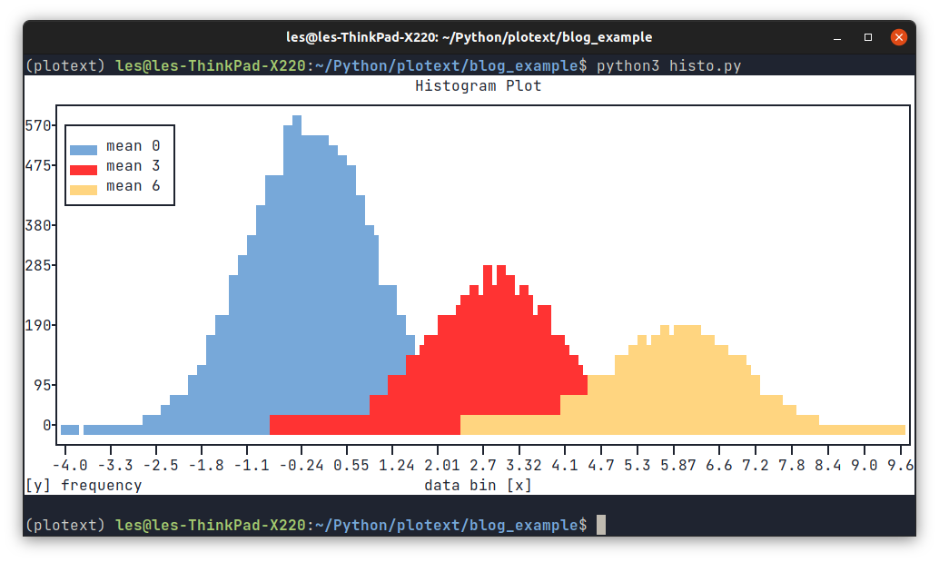
Fancy creating a histogram for a range of data? You can do that!
Happy Hacking!
I can see Plotext being used in Raspberry Pi projects that collect data using sensors, imagine streaming live sensor data directly to your terminal via SSH!